


A patio sets the tone for time outdoors. It frames backyard dinners, relaxed weekends, and evenings with friends. Color plays a large role in that atmosphere, since pavers shape the visual base for furniture, plants, and architectural details. A color palette makes a patio feel balanced and welcoming from the first glance.
This ultimate guide to choosing patio paver colors walks through practical ideas that help homeowners narrow down options with confidence. From home style to climate and outdoor décor, several factors shape the final result. Take a moment to explore these color ideas and start sketching out a patio that suits your space.
How Color Shapes the Look of a Patio
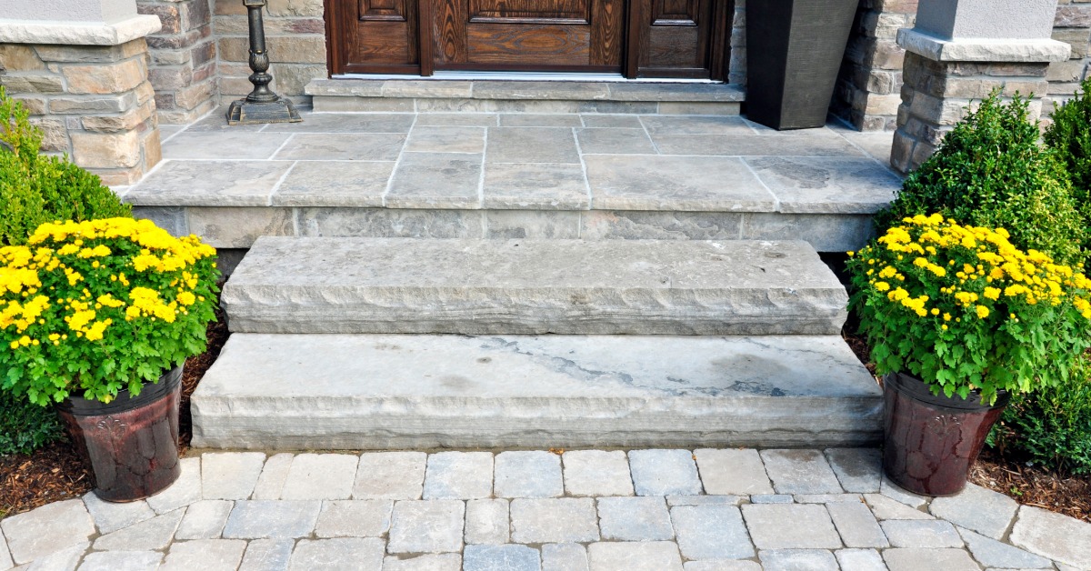
Color affects the mood of an outdoor space in subtle but powerful ways. A soft tan patio creates a relaxed coastal feel. Deep charcoal pavers bring a modern edge to the same backyard. Even small shifts in shade can change how the entire patio reads against the home.
Light colors reflect sunlight and give patios a bright, open look. They work well in smaller yards because the surface appears larger. Beige, sand, and light gray tones fit comfortably in many settings.
Darker colors add contrast and depth. Charcoal, slate, and deep brown shades anchor outdoor furniture and landscape features. These tones also hide marks from everyday use, which appeals to families with active outdoor spaces.
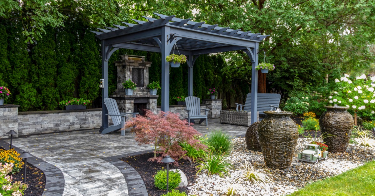
Blended color pavers offer a middle ground. Multi-tone palettes mix subtle shades in one stone, which adds texture and natural character. This style suits homeowners who want visual interest without bold contrast.
Match Paver Colors with Your Home’s Exterior
The home itself should guide color choices for a patio. When the patio reflects tones from the house, the entire property feels unified. Walls, trim, roof color, and architectural style all contribute clues for the right palette.
Homes with warm brick or earth-tone siding pair well with tan, brown, or warm gray pavers. These shades echo the tones already present on the house. The patio then feels like a natural extension of the structure.
Cool-tone homes, such as those with gray siding or slate roofing, pair nicely with charcoal or cool gray pavers. This approach creates a clean and balanced look. Stone accents on the home offer another direction. A patio that picks up subtle shades from that stone ties everything together without heavy contrast. Even a slight color connection brings visual harmony across the property.
Consider the Overall Landscape
The surrounding yard plays a large role in how patio colors appear. Grass, garden beds, and nearby trees all influence the visual effect of pavers. A yard with lush greenery pairs beautifully with neutral tones. Light tan or gray pavers allow plants and flowers to take center stage. This combination creates a calm, garden-forward atmosphere.
Yards with minimal landscaping benefit from blended or textured paver colors. Subtle color variation adds visual interest when fewer plants surround the patio. Natural environments also shape color direction. Coastal homes lean toward sandy hues and light neutrals.
Rustic settings with wooded surroundings feel right with browns and earthy tones. A patio should complement the landscape rather than compete with it. When colors reflect the environment, the entire yard feels connected.
Think About Sun Exposure and Heat
Climate and sun exposure deserve attention during color selection. The surface temperature of pavers changes depending on shade and sun levels. Light-colored pavers reflect more sunlight. This trait keeps patios cooler underfoot during hot afternoons. Homeowners in warm climates may appreciate that comfort.
Darker colors absorb more heat. These shades feel warmer during sunny days, which suits cooler regions or shaded yards. Sunlight also affects how colors appear throughout the day.
Morning light may reveal warmer undertones. Late afternoon light can deepen gray or charcoal hues. A quick look at paver samples outdoors provides a more accurate sense of color than indoor lighting. Another weather-related issue you should consider is rainfall. Buy permeable pavers if you need a way to handle complex drainage issues without losing any aesthetic value.
Blend or Contrast with Outdoor Features
The ultimate guide to choosing patio paver colors must dive into the ways to work with your outdoor features. Outdoor furniture, fire pits, and landscape features should influence color selection as well. A patio acts as the base layer for the entire outdoor setup.
Neutral pavers provide flexibility. Beige or soft gray tones work with many furniture styles and cushion colors. Homeowners who enjoy seasonal décor appreciate that versatility.
Darker patios highlight light furniture. White chairs or light wood tables stand out against charcoal or slate pavers. This approach suits contemporary outdoor designs.
Blended pavers support natural materials such as wood pergolas or stone fire features. Subtle color variation creates a relaxed and organic look across the yard. The patio should feel cohesive with the rest of the outdoor design.
Understand Multi-Tone and Pattern Options
Modern pavers come in a wide range of color blends. These options add character without dramatic contrast. Multi-tone pavers combine two or three shades within each stone, which creates depth across the patio surface.
A blend of tan, brown, and gray works well in transitional designs. This palette bridges classic and contemporary homes. The patio then fits naturally beside many exterior styles.
Pattern layout also affects color perception. A simple running bond layout produces a calm and structured appearance. Randomized patterns with mixed paver sizes create a more natural stone look.
Larger patios benefit from multi-tone pavers because the color variation prevents a flat or monotonous surface. The patio feels more dynamic and visually appealing across a large area.
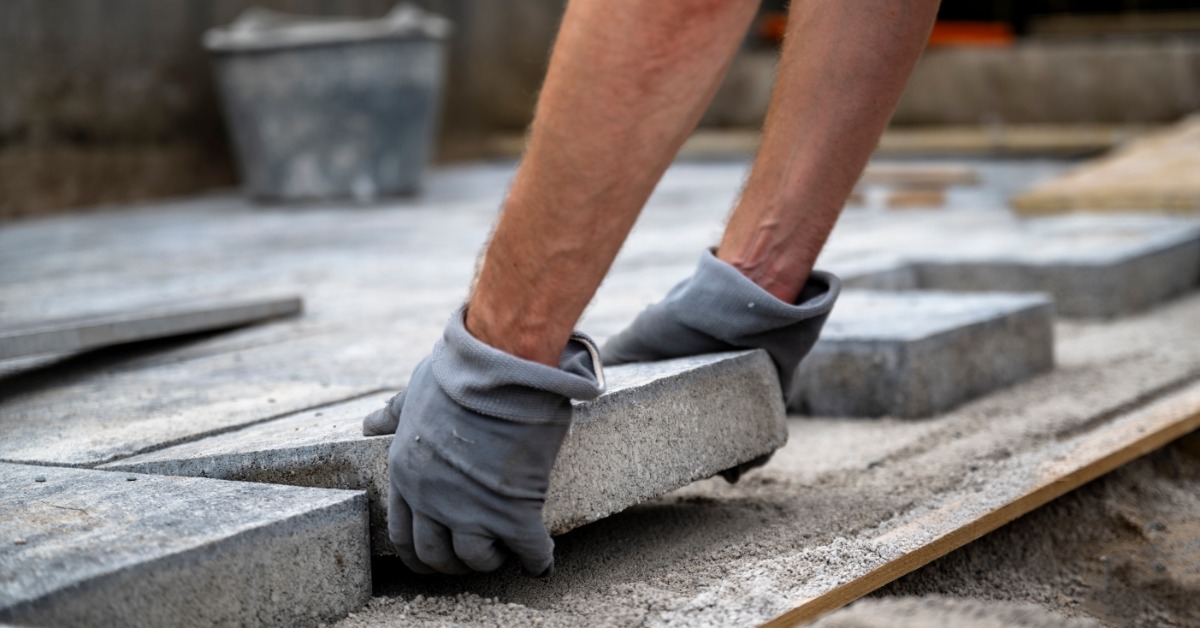
View Samples in Natural Light
Paver samples reveal far more than a printed catalog image. Outdoor lighting shows the true character of each color. A small sample placed near the home exterior provides context. Homeowners can compare pavers against siding, trim, and nearby landscape features.
Even subtle undertones become clearer in natural daylight. Viewing samples beside patio furniture or outdoor décor helps as well. This quick test shows how the entire outdoor palette works together.
Choosing Pavers That Feel Right
Color shapes the entire personality of a patio. Light tones create an open and relaxed environment. Darker shades deliver contrast and a modern edge. Blended palettes add natural texture that feels comfortable in almost any landscape.
A thoughtful approach leads to a patio that complements the home, the yard, and outdoor décor. With attention to architecture, sunlight, landscape, and furniture, the final color palette feels natural rather than forced. Start envisioning a patio that turns everyday outdoor moments into something memorable.